Website : Footer Style
- Style 1 -
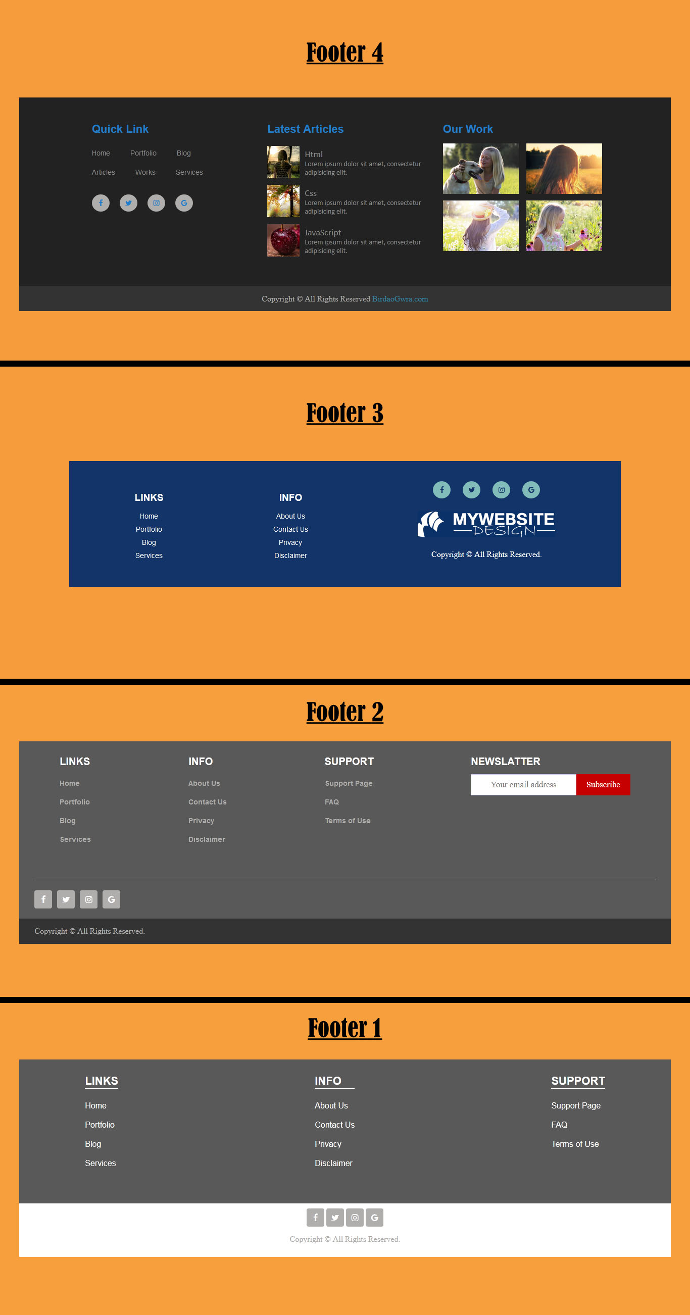
Four different type of footer style for website designing. Select any one style and add in your website. I have not added tablet or mobile media query in the source code. However it is not that hard to make it responsive. Just make the width of footer id and copyright id to 100 percent.
/* Media query for mobile */ @media (max-width: 767px) { /* Footer */ #footer { width: 100%; } /* Copyright */ #copyright { width: 100%; } }
And add flex-direction column to footer id. And you can adjust other values as you want.
/* Media query for mobile */ @media (max-width: 767px) { /* Footer */ #footer { width: 100%; flex-direction: column; } }
Just choose any one footer and re design it to fit in your website.
I captured the designing of the webpage and uploaded on youtube. You can watch the video on youtube.
You can download the file below and change it as you want.


